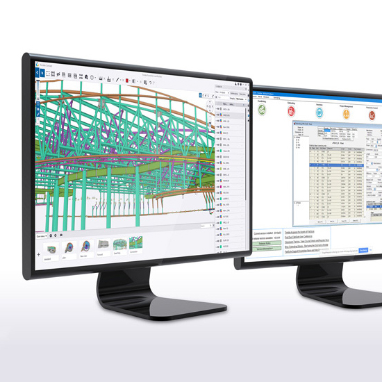
Since 1995, PMJ Structural Engineering has specialized in design of industrial steel and reinforced concrete structures. They conduct structural detailing in Tekla Structures. To optimize the work of engineers, the company has created a number of Tekla-compatible plug-ins. They help to select chosen elements of the designed structure, based on complex filters and calculations, and generate specialized drawings and reports.
I was tasked with creating new interfaces for two desktop applications under Holdfort brand, with alignment to the following guidelines:
- The applications are to be optimized visually and in terms of content;
- The applications are intended to be visually similar to Tekla (similar icons) and in the way Tekla works (introduction of user command bar);
- The applications are to be in English;
- The applications' dimensions should be as small as possible;
- The applications are to be dedicated in the first phase for internal use by company employees, with the prospect of their further development and release in the Tekla Addons Marketplace for international audience.
Client:
PMJ Structural Engineering Sp. z o.o. Sp.k.
Skills needed:
- Research of Tekla features and available add-ons
- Internal surveys conduction
- User flows creation
- Wireframing (Adobe XD)
- User interface design (Adobe XD)
- UX principles implementation
- Illustrations and icons creation (Adobe Illustrator)
- Creating presentations for feedback (Adobe XD, Microsoft PowerPoint)
Internal Study
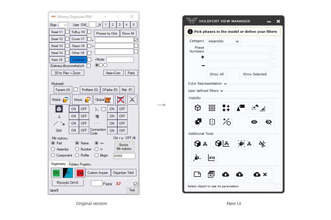
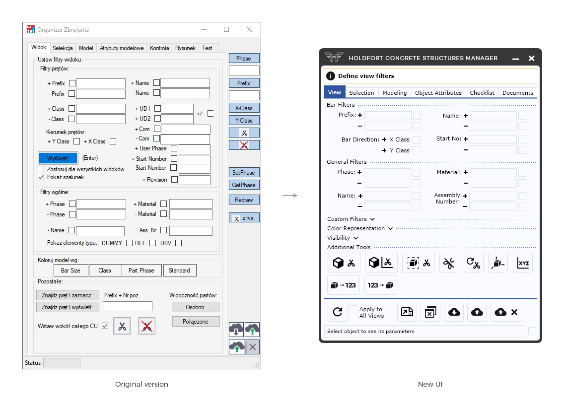
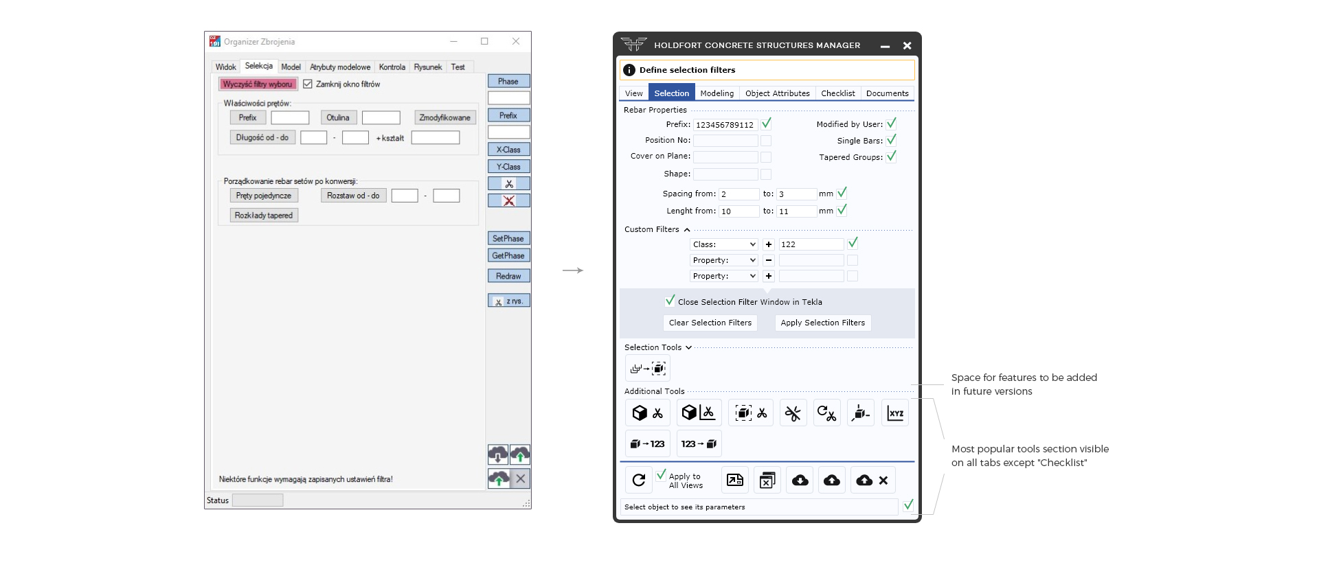
Based on surveys conducted within the company, me and developers introduced a new hierarchy of functions, separating out fixed sections of the most frequently used tools. The least used functions were removed or hidden in drop-down sections. Moreover, the functions were grouped in a way that enables chosen sections to be freely extended with new tools and customized to user's needs.
UI Design System
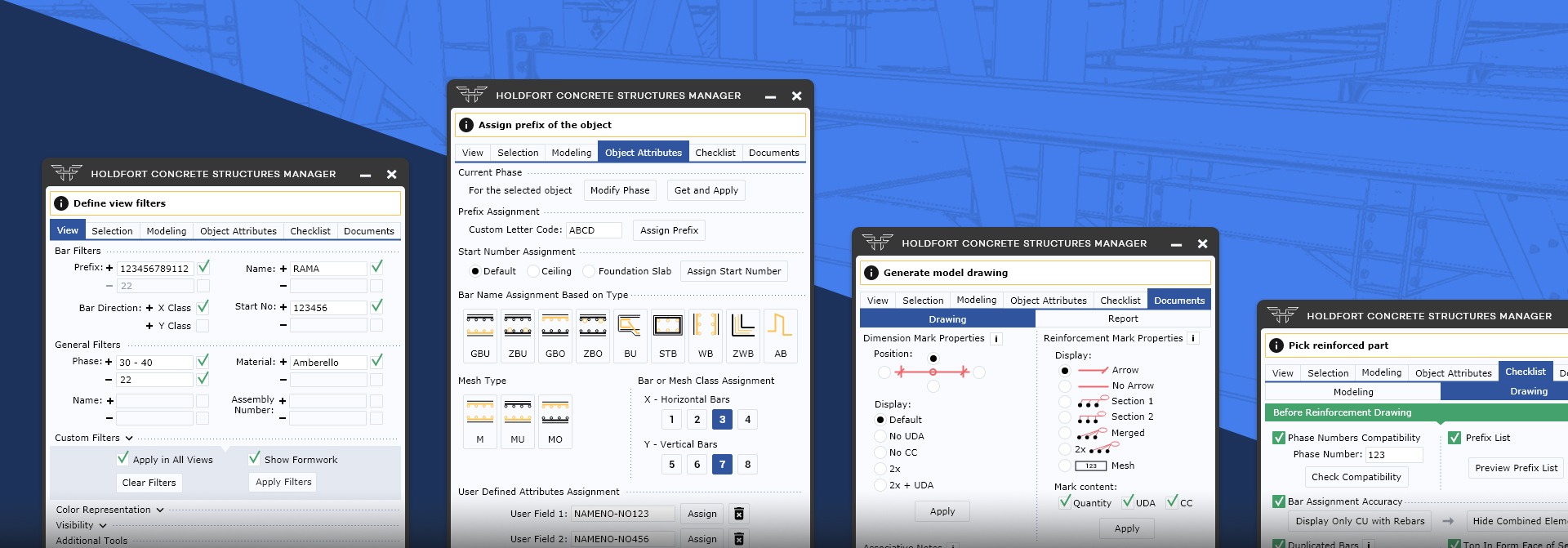
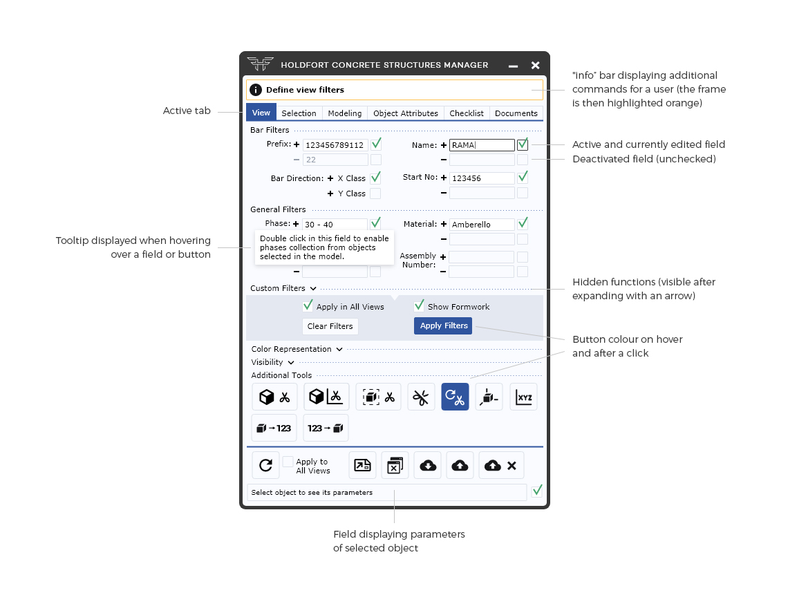
Visually, a similar style of icons has been used to those in Tekla. The colours used in the auxiliary drawings correspond to the line and guide colours used in Tekla. A used scale of elements and created layout allow maximum condensation of functions and reduction of the plug-in window size, while maintaining readability. Additional help is provided by tooltips and command bar for the user.
From several variants, the final colour version was chosen, which is comfortable to the eye (fulfilling accessibility standards) and consistent with the Holdfort brand.
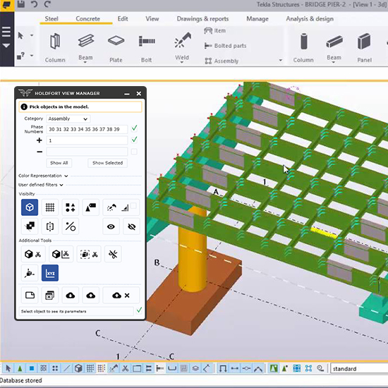
Holdfort View Manager New Interface
Basic colour palette

Icons Set
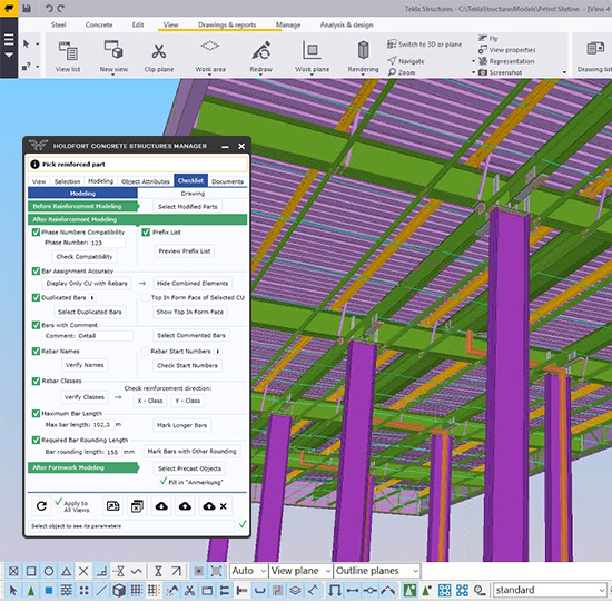
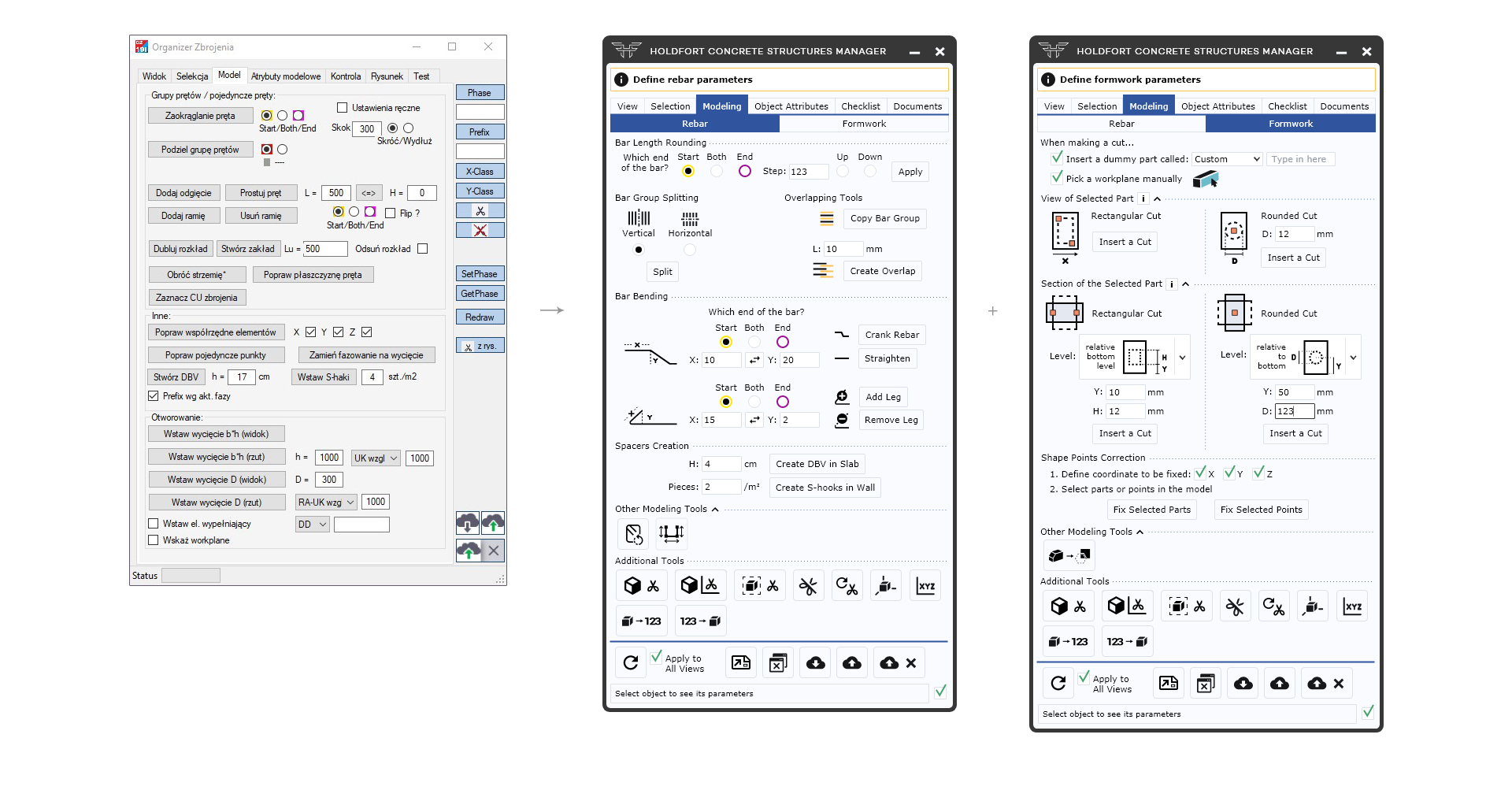
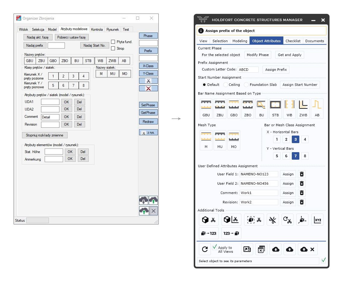
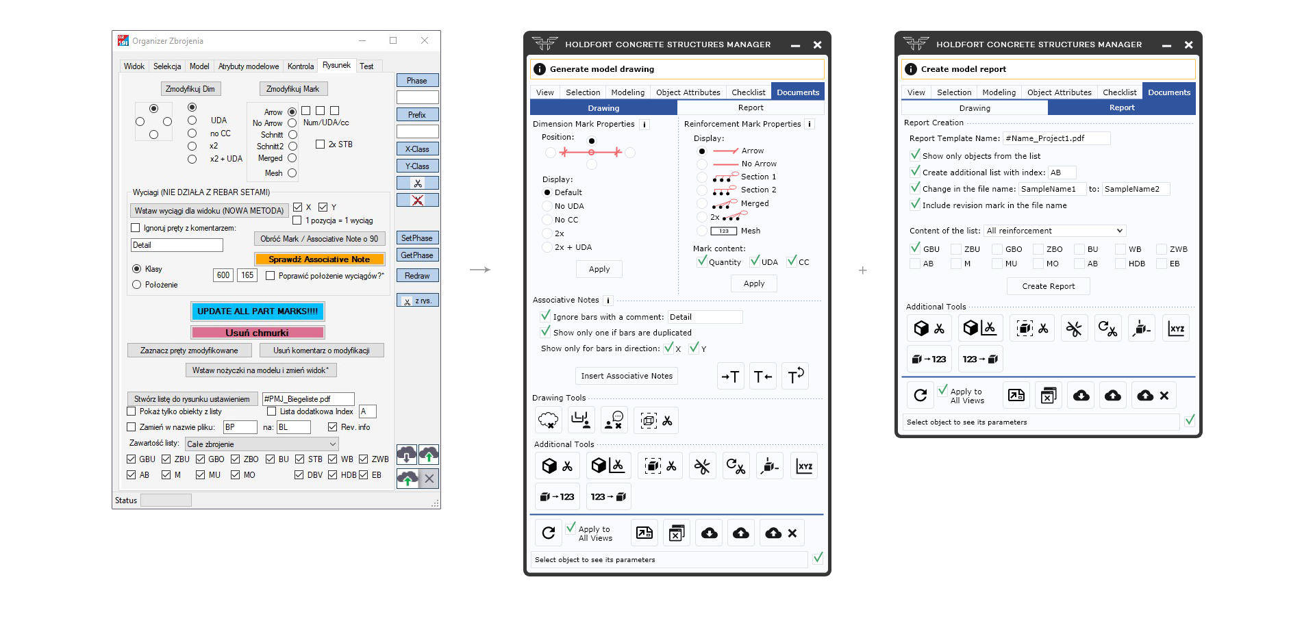
Holdfort Concrete Structures Manager New Interface
Description of the Interface Behaviour
New Interface of All Tabs
Dialog Box Style


